Choosing the perfect stamped concrete colors can transform your outdoor space from ordinary to extraordinary. The right color combination doesn’t just enhance your property’s appearance—it creates an inviting atmosphere that reflects your personal style while complementing Northern California’s unique landscape.
Whether you’re planning a new patio, driveway, or pool deck, understanding your color options helps ensure results you’ll love for decades to come.
How Stamped Concrete Colors Work
Understanding the color system helps you make informed decisions about your project’s final appearance.
Base Colors: Your Foundation
Base colors come in two forms: integral color mixed throughout the concrete and color hardener broadcast on the surface during finishing. Integral color provides consistent hue throughout the slab, ensuring durability even with minor surface wear. Color hardener strengthens the surface while adding vibrant color that won’t fade or chip away.
The base color serves as your primary tone, influencing the overall character of your finished surface.
Release Agents: Creating Natural Variation
Release agents prevent stamps from sticking while adding secondary colors that create natural-looking highlights and shadows. These contrasting tones settle into texture lines, mimicking the color variations found in real stone, brick, or wood.
Professional contractors often use multiple release colors to create even more realistic, natural-looking results.
Top Stamped Concrete Colors for Northern California
Our region’s architectural styles and natural environment influence which colors work best for local properties.
Gray: The Versatile Champion
Gray remains the most popular choice among Northern California homeowners, and for good reason.
Light Gray Options
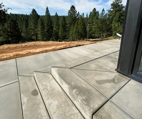
- Creates clean, modern appearances
- Stays cooler underfoot during summer months
- Complements both warm and cool landscape palettes
- Shows less everyday dirt and debris
Medium to Dark Gray Combinations
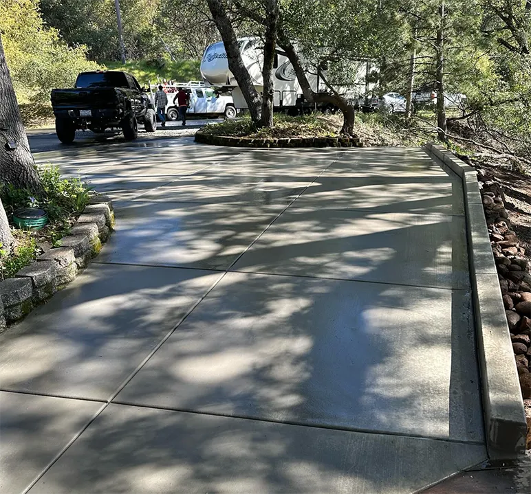
- Provides sophisticated contrast against lighter home exteriors
- Mimics natural slate and bluestone beautifully
- Works exceptionally well for contemporary and transitional home styles
- Offers excellent hiding power for stains and wear patterns
Popular gray combinations include light gray base with medium gray release, or medium gray base with charcoal release for dramatic depth.
Earth Tones: California’s Natural Palette
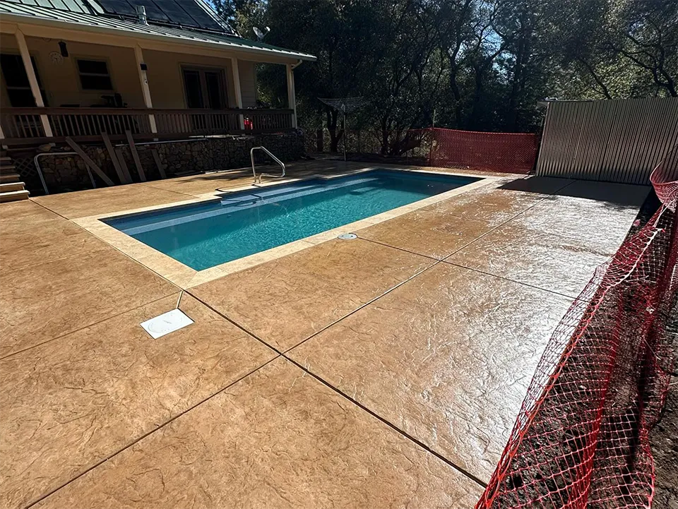
Earth tones consistently rank among top choices because they echo our region’s natural golden hills and stone outcroppings.
Buff and Tan Families: These warm, neutral colors provide timeless appeal that photographs beautifully and complements traditional California architecture. Buff integral color with walnut or nutmeg release creates stunning natural stone appearances.
Rich Browns: Cappuccino and adobe buff base colors paired with autumn brown or desert tan release agents produce rich, inviting surfaces perfect for entertainment areas and front entrances.
Sandstone Inspirations: Light sandstone colors with subtle brown release create surfaces that blend seamlessly with drought-resistant landscaping while maintaining visual interest.
Terracotta and Reds: Mediterranean Heritage
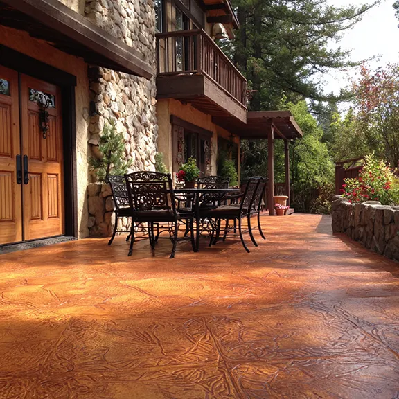
These colors celebrate California’s Spanish colonial roots while creating dramatic focal points.
Terra cotta base colors with darker red or brown release agents work beautifully with Mediterranean and Craftsman-style homes. These warm tones create inviting outdoor spaces that feel connected to our region’s architectural heritage.
Consider lighter terra cotta shades for large areas to prevent overwhelming your landscape design.
Charcoal and Black: Bold Modern Statements
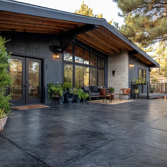
Dark colors create striking contemporary looks but require careful consideration in Northern California’s climate.
Charcoal base with black release provides sophisticated drama for modern homes, while black base with gray release offers bold contrast with lighter architectural elements.
Remember that darker colors show dust, leaves, and water spots more readily, requiring more frequent maintenance in our dry climate.
Color Combinations That Work
Single-color stamped concrete often looks artificial. Professional results come from thoughtful color layering.
Subtle Variations: Similar tone combinations create natural-looking depth without overwhelming your design. Light gray base with medium gray release, or buff base with tan release, provides gentle variation that mimics real stone.
Dramatic Contrasts: Bold combinations like white base with charcoal release or light sandstone with dark brown release create eye-catching surfaces perfect for statement areas.
Multiple Release Technique: Using two different release colors during stamping creates even more realistic appearances. Apply lighter release first, then add darker tones to specific areas for natural shadowing effects.
Climate Considerations for Color Selection
Northern California’s varied climate affects how different colors perform over time.
UV Resistance: Our intense summer sun can fade certain colors more quickly than others. Lighter colors generally maintain their appearance longer, while darker colors may require more frequent sealer application to prevent fading.
Quality color systems and professional application significantly improve all colors’ longevity.
Heat Reflection: Light-colored surfaces reflect heat, staying cooler for bare feet around pools and entertainment areas. This becomes crucial during our hot summer months when dark surfaces can become uncomfortably warm.
Seasonal Appearance Changes: Consider how your chosen colors will look with both spring flowers and autumn foliage. Neutral earth tones provide consistent appeal throughout our distinct seasons.
Design Tips for Color Success
Creating cohesive outdoor designs requires thoughtful color coordination with existing elements.
Architectural Harmony: Your home’s exterior should guide concrete color selection. Warm-toned houses typically showcase earth-colored concrete beautifully, while cooler exteriors pair well with gray or slate tones.
Landscape Integration: Consider your established landscaping and planned plantings. Earth tones complement drought-resistant plants, while grays work well with both traditional and contemporary landscape designs.
Size and Scale Factors: Lighter colors make small spaces appear larger, while darker colors create intimate, defined areas within larger landscapes. Large patios can handle bolder color contrasts that might overwhelm smaller walkways.
Professional Application Techniques
Achieving beautiful, consistent colors requires expertise in timing, weather conditions, and proper product application.
Weather Considerations: Northern California’s variable weather affects color application. High temperatures, wind, and humidity all influence how colors develop during the crucial finishing period.
Timing Precision: Color hardener application timing affects final appearance significantly. Too early, and colors may be diluted by bleed water. Too late, and colors won’t properly integrate with the surface.
Sample Importance: Always request on-site samples before full installation. Lighting conditions, surrounding colors, and concrete mix variations can all affect final appearance compared to showroom samples.
Maintenance for Long-Lasting Color
Proper maintenance preserves your investment and keeps colors vibrant for decades.
Cleaning Best Practices: Regular cleaning with appropriate concrete cleaners prevents buildup that can dull color appearance. Avoid harsh chemicals that damage color systems, and address spills immediately to prevent permanent staining.
Sealer Selection Impact: Sealer choice significantly affects color appearance. High-gloss sealers enhance colors dramatically, while matte sealers provide protection with minimal appearance change.
Resealing Schedule: Northern California’s climate typically requires resealing every 2-3 years to maintain color protection and surface integrity. High-traffic areas may need more frequent attention.
Base Colors vs Highlight Colors
Understanding the difference helps you communicate effectively with contractors and achieve desired results.
Base Color Options
- Integral colors mixed throughout concrete provide lasting, consistent color
- Color hardeners applied during finishing create vibrant surface colors
- Both options offer excellent durability when professionally applied
Highlight Color Techniques
- Release agents create secondary colors and natural variation
- Hand-applied stains add unique, custom color effects after stamping
- Multiple release colors create the most realistic natural stone appearances
Cost Considerations
Color choices affect project costs in several ways beyond initial material expenses.
Initial Investment: Premium color systems cost more initially but provide superior longevity and fade resistance. Multiple color applications require additional labor but create more valuable finished results.
Long-term Maintenance: Some color combinations require more frequent cleaning or sealing to maintain their appearance. Factor these ongoing costs into your decision-making process.
Property Value Impact: Well-chosen colors that complement your home and landscape typically provide better return on investment than bold colors that may not appeal to future buyers.
Getting Professional Color Guidance
Selecting the perfect color combination requires balancing aesthetic preferences with practical considerations specific to your property.
Color samples help visualize options, but actual jobsite samples provide the most accurate representation of final results. Lighting conditions, surrounding colors, and your specific concrete mix all influence final appearance.
Working with experienced local contractors ensures proper color application and realistic expectations about long-term performance in Northern California’s unique climate conditions.
Ready to create stunning stamped concrete with perfect color combinations for your Northern California property? Contact Noble Cortes General Engineering at 530-363-4964 to discuss your project and see samples of our most popular color combinations in person.
